
Promo.com Web Editor
Promo.com is a video creation platform for businesses and agencies. With its ready-made templates, pre-edited music and an online editor it helps users make loads of visual content and unlimited videos to promote anything online.
My Role
After moving from Moscow to Tel Aviv I joined Promo.com (aka Slidely back then) as the only designer in the company collaborating closely with product managers, engineers, content strategist, business analyst and stakeholders to develop the emerging video platform.
Over the course of 8 months I redesigned the version 2.0 of the video editor working on the new features in parallel as well as making continuous pricing page iterations throughout the whole time here.
Some other projects I took care of were: optimizing the mobile funnel, creating a cancellation flow for reducing customer churn, designing Music and Ratio tabs, rethinking the “Publish page” and multiple platform revamps.
The New Editor Goals
You’ve probably noticed that video has become the game-changer online these days but still not everyone has money and resources to invest in complicated shooting and then editing. This project was an exploration of how the new video editor can become more clear, functional and easier to use tool.
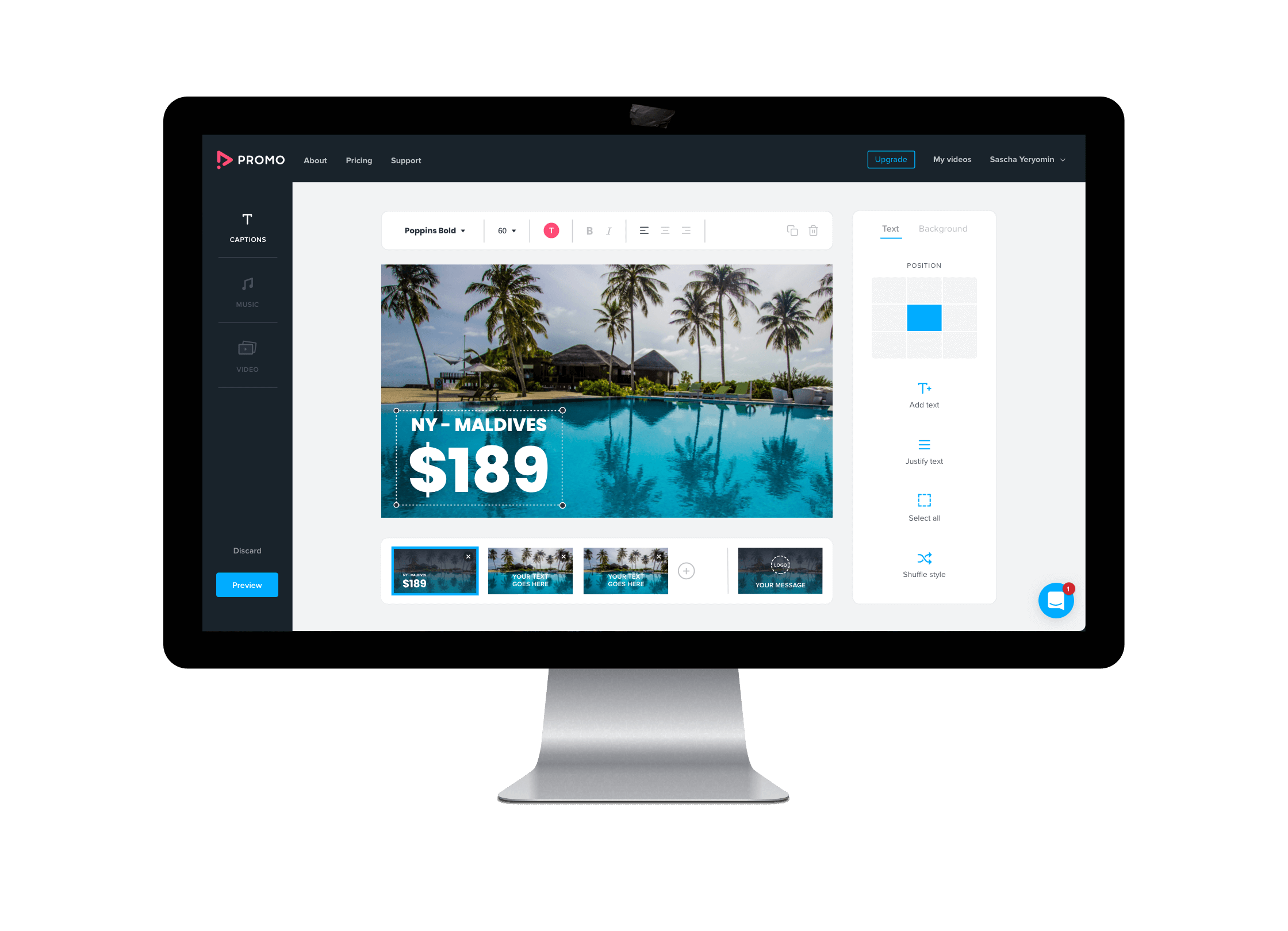
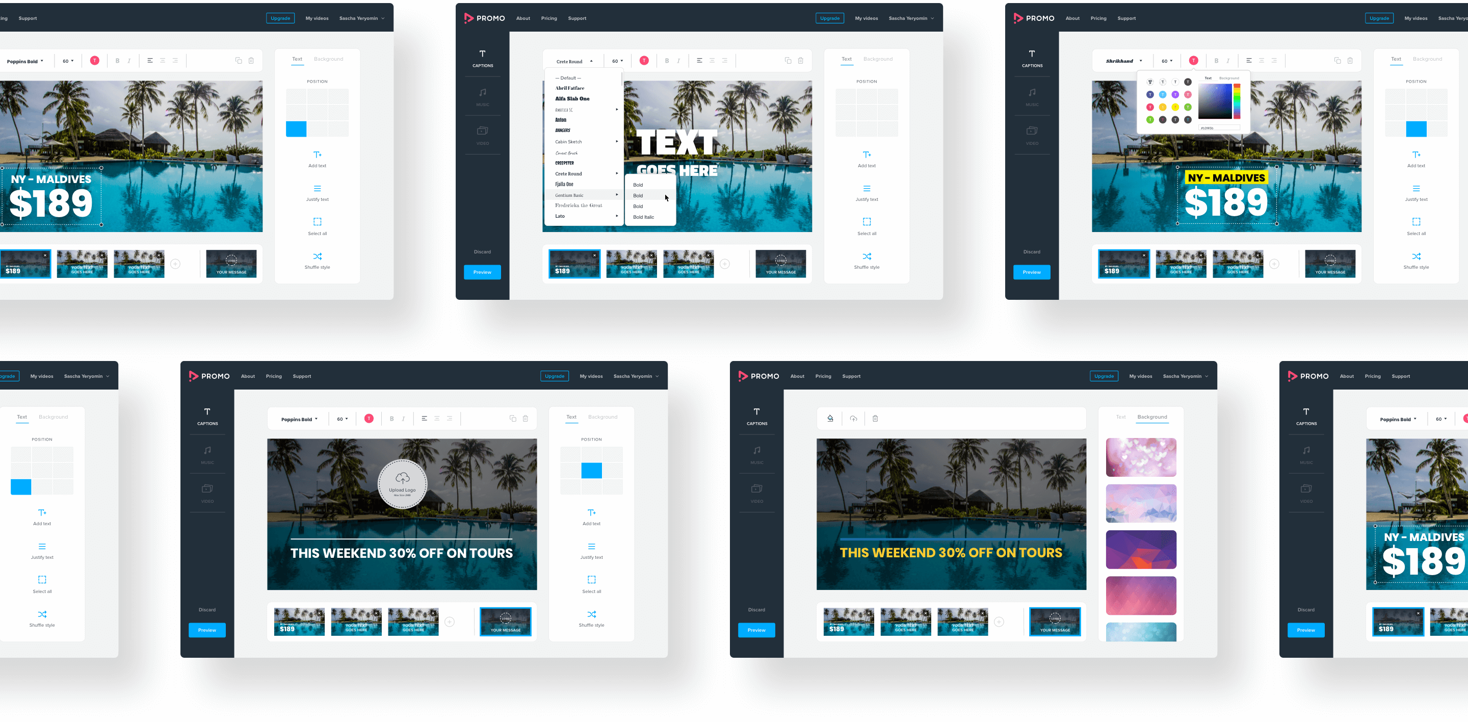
We knew that some users were confused about how to add or remove new captions for the video which most likely hurt conversion rates. Thus my focus, then, was on rebuilding editor controls in a more intuitive, elegant way by reorganizing them into two floating bars and making a number of improvements to the overall experience.
Research and Explorations
Aside from the basic competitive research and some qualitative/quantitative data, I accompanied by customer support lead and PM conducted interviews with 8 small business owners trying to stay unbiased and as neutral as possible. We were looking forward to pointing out common pain points from the quotes and translate them to clear goals.
From the usability sessions with customers, we extracted some constructive human insights. Generally, they appreciated the ease of use and speed of content creation. The most frequently met weak point was that “the options for adding text to a video are limited and it would be great to see more text editing features available without making it overly complicated”.
Top and Side Bar Navigations
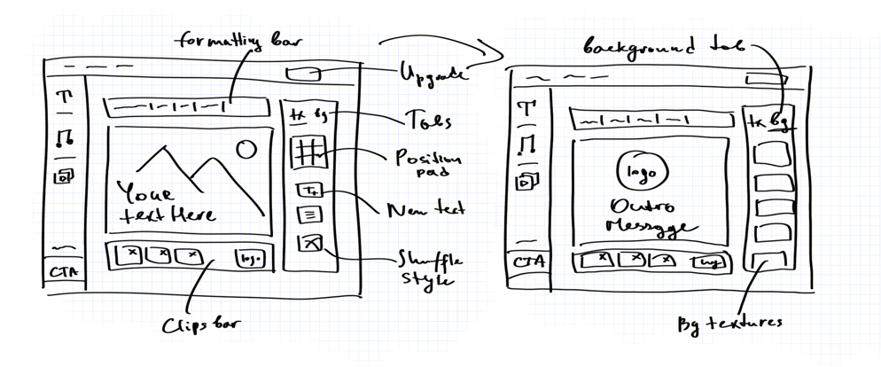
We knew that the editing component is central to the flow. To keep the layout of the editing controls clean and straightforward, I separated this component into Top and Side toolbars. The top bar contains only text-editing specific options, a pattern already familiar to the users from other tools, such as font and size picker, text alignment, bold (B), italic (I) and color shortcuts, visually grouped by separators.
I wanted to make sure the experience of adding new text to the clip is just a click of a mouse, so I focused on a simple display of the main quick controls: text position pad, clear call to actions “Add text” and “Justify text”, “Select all” text styles button and a new cool feature “Shuffle style”, a style randomizer. We also information hierarchy Text / Background Tabs.
Next Steps and Learnings
The released version of the editor has been well received by our customers and showed positive results. However, our team and stakeholders were already dreaming of much bigger challenges that would make the tool the leading service in its niche: video timeline and multiclips support, aspect ratio picker and animated text styles, projects I’ve been part of in the following iterations.
My main takeaway back then was that having a big ego does not help you work better with others, designs should be a way to help your team make wiser product decisions. As well as the time for research and test throughout the project is indisputable in the long run. It’s always helpful to encourage coworkers to join the testing sessions and share the insights early on.
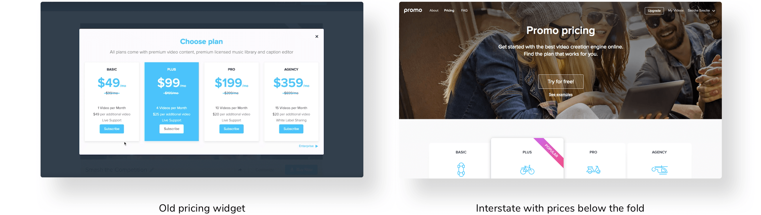
Redesigning the Pricing Page
Once we launched the new editor, we started actively working on the Pricing page because we saw a real conversion opportunity from a page that had a lot of potential for the business. With that being said, we were realizing it’s reasonably tricky to communicate value and distinction in a short simple manner.
During all iterations of 2017-2018, we were facing the same doubts that many service companies have when redesigning their pricing pages: how can we provide users with the information they need without overloading them with tons of data and avoid frightening them off while still showing the full range of knowledge of our product.
Product and UX Goals
As a startup ourselves, it was critical for us to make the second most popular page as much as clear and transparent as possible to help small business owners achieve great results with us. Therefore our efforts were focused on these goals:
1. Understand the psychology of high-converting pricing pages for driving visitors to sign up for a free product or turning free trial users into paying customers.
2. Offer a new annual billing model showing how consumers can save nearly up to 50% per month and make it the default one.
2. Create a more positive, explanatory and trustworthy user experience including new sections and revamping the visuals.
Process and Iterations
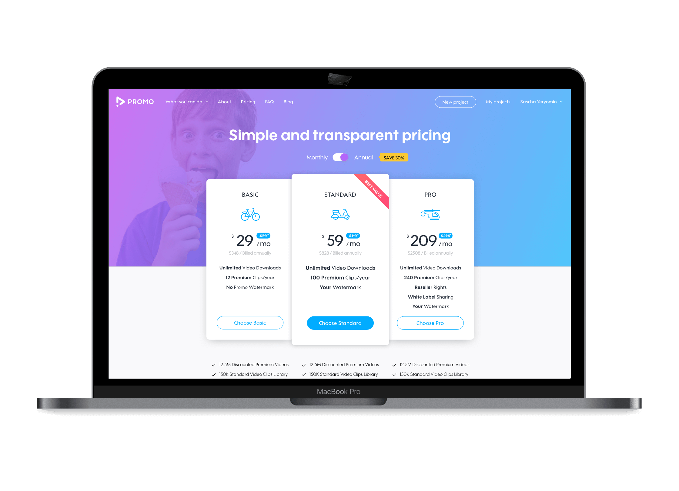
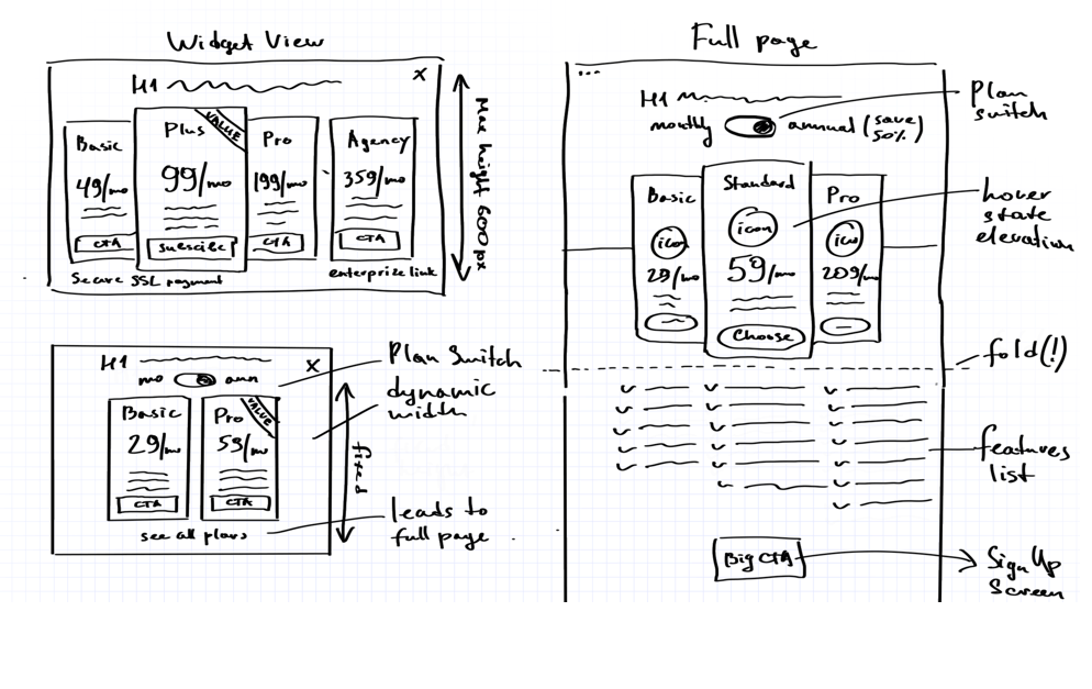
This had to be a dedicated page so after checking the data and some research I started sketching the new layout ideas. Since one of the goals was to get people to understand and click on the plans, I came up with the concept of the animated cards including FAQs and Testimonials sections below the fold.
I decided to go with visual metaphors for plans as it could draw the attention of users and positively influence their actions. Basic corridor tests showed that the “means of transportation” concept won. Eventually, we animated the cards and icons in the final iterations to make the essential “Wow” effect and add some motion to the page.
The tricky part here was to arrange multiple elements on the fold still having call to action buttons visible on smaller resolutions and highlight the monthly / annual toggle with “50% Save” badge. Because of people are usually paralyzed by choice, we tried to shorten the number of feature lists and moved to the popular 3 packages model in a longer perspective.
My Takeaways
Running multiple A/B tests for each of the iteration helped us train the muscle and know what worked in the end. Surprisingly, even the provocative “Icecream boy” image I insisted to test for the hero image, positively affected the purchasing. Our initial hypothesis was proven correct. Optimizing the pricing page was one of the biggest wins of 2018 and directly led to increasing the conversions.
I learned that the pricing page which is both informative and actionable inspires confidence in users. “Simplicity is a key” rule works for every aspect here: from content and layout to benefit-driven language. As well as having plans and features separated from the main pricing cards allows it to remain simple but still gives enough information to make an informed decision.
I’d love to build something great with you, say hi.
Copyright